What is simple linear regression, and how is it used?
Simple linear regression is a statistical method used to establish the relationship between two variables, one dependent and the other independent. It is the most basic form of regression analysis, where we predict the value of one variable based on the value of another, called the dependent variable.
We aim to predict Y, using X as the independent variable to inform these predictions. This approach is termed simple regression because it involves only a single predictor variable.
Simple linear regression is widely used in real-world scenarios. For instance, retailers might predict sales revenue based on advertising spending to improve marketing budgets. Similarly, educational institutions could predict student performance using study hours to identify trends. In healthcare, researchers might model blood pressure as a function of age to understand risk factors. These examples highlight how the method helps uncover patterns and inform industry decisions.
Platforms like Auxin AI make using advanced statistical modeling tools easy. They provide secure, user-friendly solutions that help developers build AI applications quickly while keeping data safe. Auxin AI also simplifies regression analysis by offering tools to connect different AI models securely, saving time and reducing costs.
To better understand the linear regression concept, consider an example of how an individual’s years of experience (X) influence their annual compensation (Y). As experience increases, salary rises proportionally, forming a linear relationship. The graph below illustrates this connection, showing how simple linear regression effectively models such trends.
The mathematical representation of simple linear regression is expressed as:
y= mx + c
Here:
m represents the slope and describes the relationship between x (the independent variable) and y (the dependent variable).
c is the intercept, which denotes the value of Y when X=0.
The slope (m) and intercept (c) are critical coefficients derived from the data. Their values determine the accuracy with which the model predicts outcomes. Depending on whether the relationship between X and Y is direct or inverse, these coefficients can be positive or negative.
Implementing Simple Linear Regression in Python
We will use an actual dataset to demonstrate the application of linear regression analysis. Specifically, we’ll be working with employee salary data, which contains information on employee experience and corresponding salaries.
Setting up your system
Skip Installing Python and use Online Jupyter Platform
I used Google Colab to build a machine learning model in this tutorial. Google Colab, short for Google Colaboratory, is a free, cloud-based platform that lets you write and execute Python code in a Jupyter notebook environment.
It’s beginner-friendly and ideal for machine learning tasks, providing access to powerful computational resources like GPUs and TPUs, making it an excellent choice for machine learning projects. Let’s start to set it up by adding the application to Google Drive.

Open Drive and select the New button. In the dropdown menu, select Connect more apps (if you don’t already have Google Colab enabled), search for Colab, and add it to your Drive.
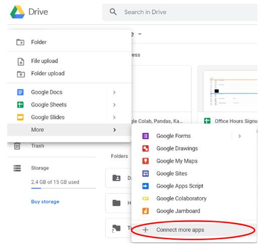
Finally, please create a new Colab notebook by clicking the new button and finding it in the More drop-down menu. That’s it. We’re all set up and ready to get started.
Data Collection
We need Pandas for data manipulation, NumPy for mathematical calculations, and Matplotlib, and Seaborn for visualizations. Sklearn libraries are used for machine learning operations.
# Import libraries
import pandas as pd
import numpy as np
import matplotlib.pyplot as plt
import seaborn as sns
from sklearn.model_selection import train_test_split
from pandas.core.common import random_state
from sklearn.linear_model import LinearRegression
Load and Explore the Dataset
We will load the dataset, check its structure, and read it into a Pandas dataframe.
# Get dataset
df_sal = pd.read_csv('Salary_Data.csv')
df_sal.head()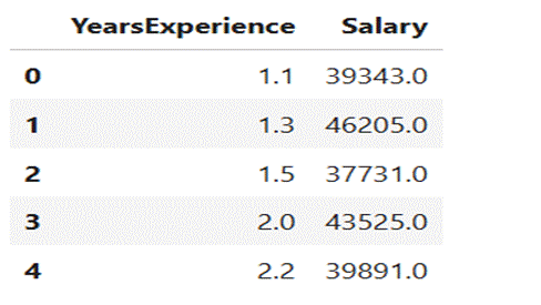
Data analysis
Descriptive Statistics
Now, let’s analyze the dataset to understand its structure.
# Describe data
df_sal.describe()
Strategic Highlights
- Salary ranges from 37,731 to 122,391.
- Median salary is 65,237.
Visualize Data distribution
We can also find how the data is distributed visually using the Seaborn displot.
# Data distribution
plt.title('Salary Distribution Plot')
sns.distplot(df_sal['Salary'])
plt.show()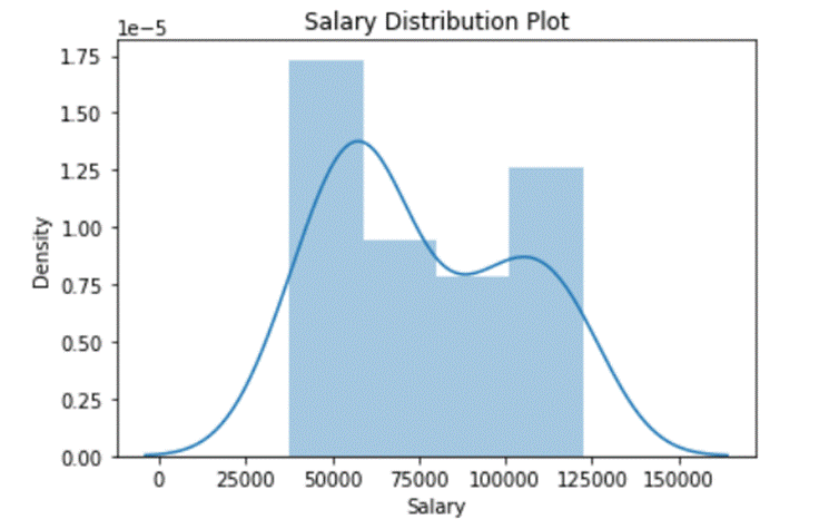
Relationship Between Variables
Visualize the relationship between “Years of Experience” and “Salary.” A distplot shows how data is spread out. It uses a line and a histogram to display the data. Later, we will check the relationship between salary and experience.
# Relationship between Salary and Experience
plt.scatter(df_sal['YearsExperience'], df_sal['Salary'], color = 'lightcoral')
plt.title('Salary vs Experience')
plt.xlabel('Years of Experience')
plt.ylabel('Salary')
plt.box(False)
plt.show()
Later, we will check the relationship between salary and experience.
Now it’s clear whether the individual receives a higher salary as they gain experience.
Split the dataset into dependent/independent variables
Experience (X) is the independent variable
Salary (y) is dependent on experience
# Splitting variables
X = df_sal.iloc[:, :1]  # independent
y = df_sal.iloc[:, 1:]  # dependent
Split the dataset into Training and Testing Sets
Separate independent (X) and dependent (y) variables, then split into training (80%) and testing (20%) sets.
# Splitting dataset into test/train
X_train, X_test, y_train, y_test = train_test_split(X, y, test_size = 0.2, random_state = 0)
Fitting the Model
Pass the X_train and y_train data into the regressor model by regressor fit to train the model using training data.
# Regressor model
regressor = LinearRegression()
regressor.fit(X_train, y_train)
Make Predictions
Once the model is trained, we can use it to predict the test data.
# Prediction result
y_pred_test = regressor.predict(X_test)     # predicted value of y_test
y_pred_train = regressor.predict(X_train)   # predicted value of y_train
Visualize the Results
Now that we have our predictions, let’s visualize the results through plotting graphs.
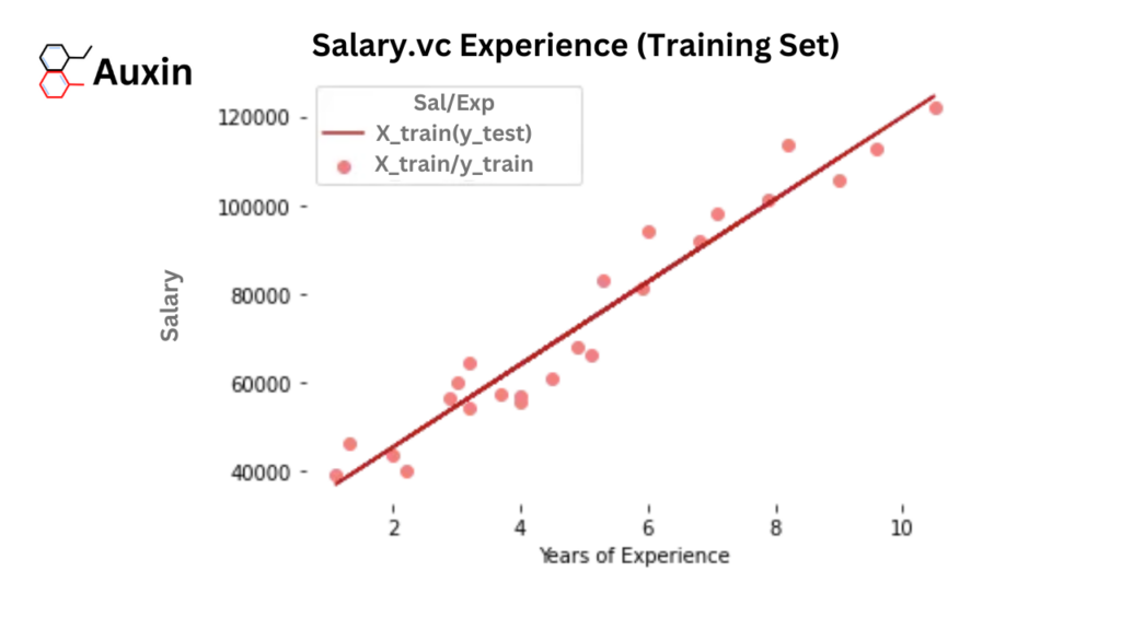
- Training Set Results
Firstly, we plot the results of training sets (X_train, y_train) with X_train and the expected value of y_train (regressor.predict(X_train))
# Prediction on training set
plt.scatter(X_train, y_train, color = 'lightcoral')
plt.plot(X_train, y_pred_train, color = 'firebrick')
plt.title('Salary vs Experience (Training Set)')
plt.xlabel('Years of Experience')
plt.ylabel('Salary')
plt.legend(['X_train/Pred(y_test)', 'X_train/y_train'], title = 'Sal/Exp', loc='best', facecolor='white')
plt.box(False)
plt.show()- Testing Set Results
Secondly, we plot the results of test sets (X_test, y_test) with X_train and the expected value of y_train (regressor.predict(X_train))
# Prediction on test set
plt.scatter(X_test, y_test, color = 'lightcoral')
plt.plot(X_train, y_pred_train, color = 'firebrick')
plt.title('Salary vs Experience (Test Set)')
plt.xlabel('Years of Experience')
plt.ylabel('Salary')
plt.legend(['X_train/Pred(y_test)', 'X_train/y_train'], title = 'Sal/Exp', loc='best', facecolor='white')
plt.box(False)
plt.show()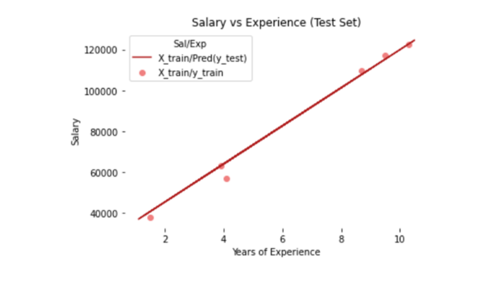
Graph Analysis: The regression line fits training and testing datasets well to confirm a strong linear relationship.
Model Summary
We discussed the linear equation y = mx + c; we can also get the c (y-intercept) and m (slope/coefficient) from the regressor model.
| Metric Value | |
| Coefficient | m (Slope) |
| Intercept | c |
# Regressor coefficients and intercept
print(f'Coefficient: {regressor.coef_}')
print(f'Intercept:{regressor.intercept_}')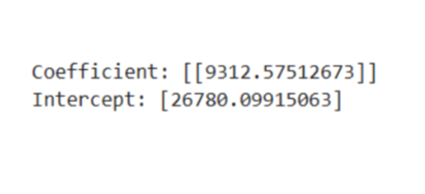
Full Code at Auxin GitHub
You can download the entire code and the notebook from our Auxin Github.
Simple linear regression is a powerful tool for predicting linear relationships between variables. We demonstrate how this method effectively estimates outcomes by modeling the connection between experience and salary.
The equation y= mx+c forms the essential component of this approach, where m and c are necessary for accurate predictions. We implement this equation in Python to visualize and validate these predictions, highlighting the model’s efficiency in real-world applications. To improve scalability and security in AI-driven applications, platforms like Auxin AI provide low-code solutions that simplify development while protecting data integrity.